This is a repost of a series of article I originally published for Songbird.

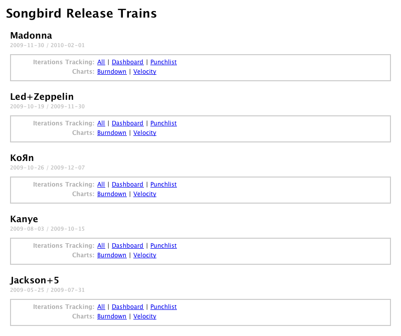
We concluded that a dashboard that was more dynamic and worked in real time with Bugzilla would provide a more accurate picture of development progress. This is an overview of the couple of extensions I added to the tool.
Dashboard
The dashboard focuses on the current iteration (all P1 stories/tasks/bugs for a release target milestone). It provides a transparent and dynamic view of what’s under active development for the week.
Items are grouped by developer so we can easily review what each person is working on in this iteration. There are few additions that make it more useful than a plain Bugzilla query. When an item is carried over from a previous iteration, it gets highlighted, providing visibility on something that may require more work than anticipated or might be blocked by some dependencies. That kind of view was lacking before and it made it difficult to figure out what was happening when tasks got carried over. Similarly, when a new task gets added to the plan mid-iteration, it’s identified as such, making the tracking of intake very easy.
Because of our code review system, often time tasks are completed from a programmer standpoint but can’t be checked in until a positive review (R+) is performed by someone else. Additionally, some code requires the re-compilation of large amounts of 3rd party libraries before the patch is available. This kind of information is now bubbled up on the tracking page so the exact status of a particular issue is visible at a quick glance.
![]()
This dashboard is helping us to know what everyone is doing at any given time. It fosters a sense of accountability and ownership of the issues and provides a sense of accomplishment when the work is completed.
Below is a view of the legend for the Dashboard. Most attributes for an item are extracted from Bugzilla and represented via an icon.
![]()
Punchlist
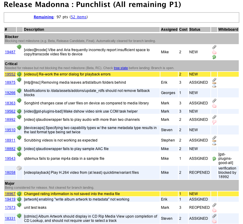
Once a release reaches QA, a release branch is cut and the focus of the team switches from working on planned features to fixing bugs. We found that this period is best managed by using a punch list which contains all the issues remaining to be resolved before the release can ship as opposed to a weekly plan of what gets accomplished for the period. It keeps the team focused on the entirety of what’s on our collective plate. During that period, issues are being promoted to Blocker status to represent what is blocking the next milestone (e.g. Beta, RC, Final). It also signals what can be landed on the branch automatically and what needs further clearance. This allows us to throttle the rate of change being introduced into the source tree so that QA can be ensured stable builds.

When in punchlist mode, it’s critical that all issues are being assigned. The list reflects that by highlighting items that have no owner yet.
Pretty Graphs
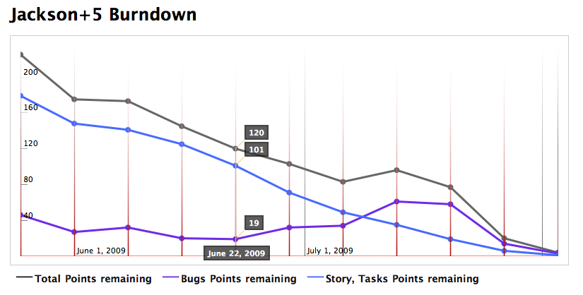
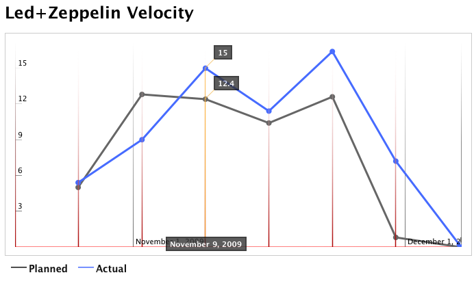
Two frequently tracked Agile metrics are burndown and velocity. Those are now being graphed automatically for each release. The burndown helps forecast when the work will be completed. The velocity gives us a historical perspective on what the team was able to accomplish and thus helps us plan better.
The burndown graph breaks down tasks (what we refer to as “planned work”) from bugs (unplanned consequences of software development). When the burndown line cross the horizontal axis, we’re done. Notice in the graph below the bug points going up during the QA period.

The velocity graph plots the team velocity, normalized per day. actual velocity is computed at the end of each iteration and plotted along side the planned velocity for easy comparison.

These new tools provide a dynamic view of the state of the release. They bring transparency into the development process for everyone involved.